art 366 : explorations in design
project 01: alphabet


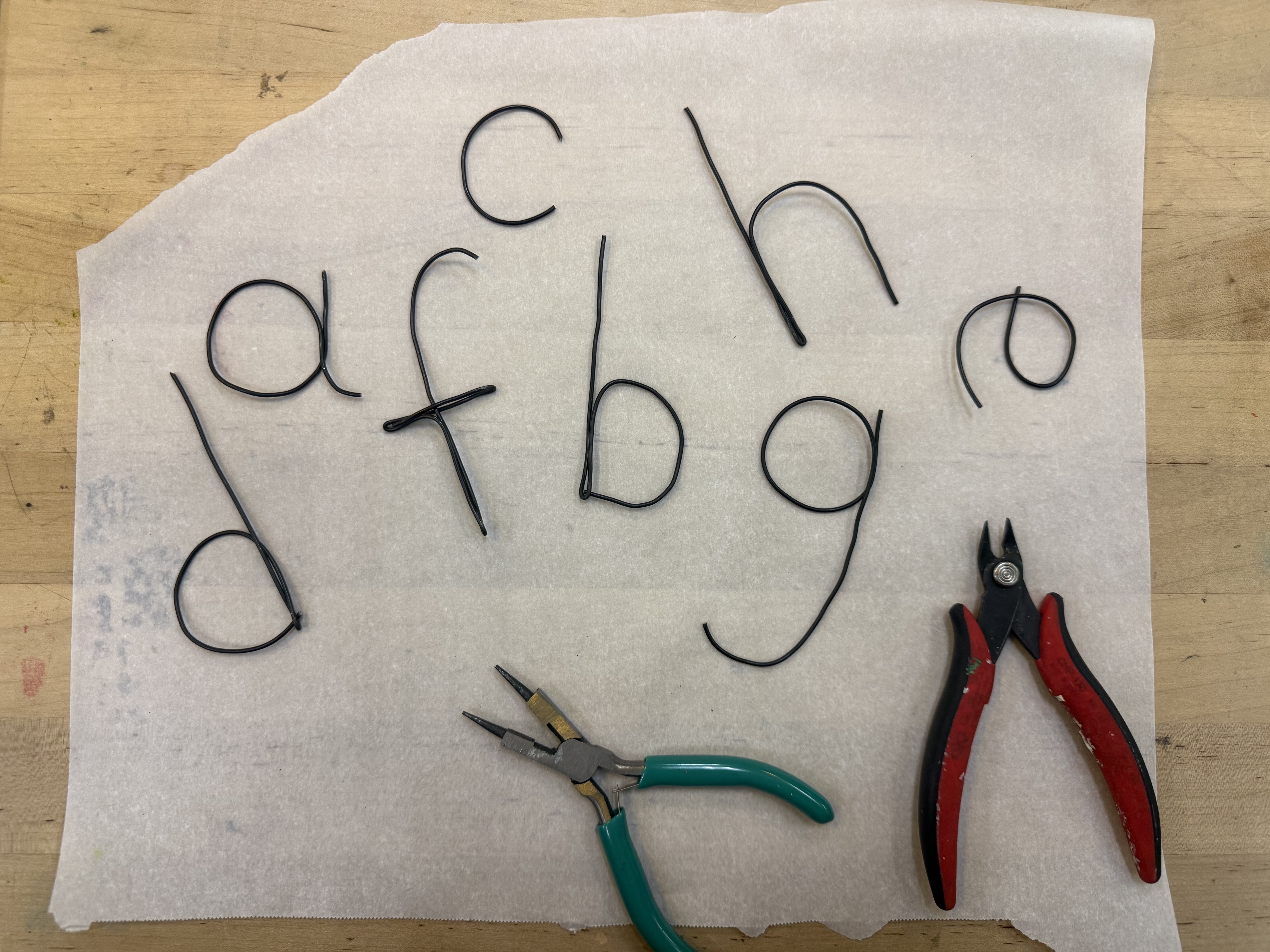
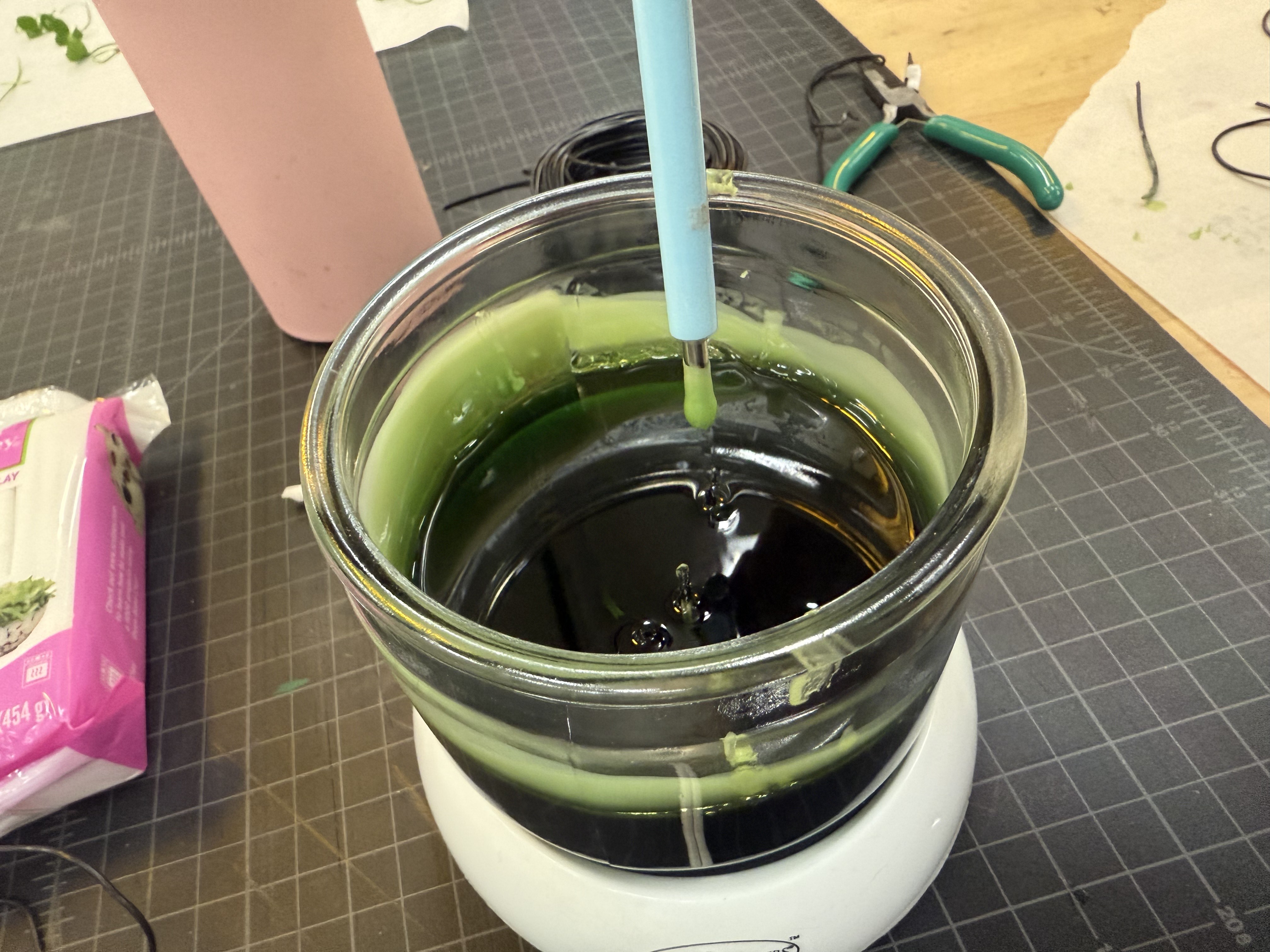
The initial plan was to make letters using droplets of wax, but it didn't seem to work well. The next plan was to dip wired letters into wax, but just like the initial plan- it didn't work well. The end product was too predictable and not interesting enough.
Then, one day while trying to figure out what to do next, my eyes landed on some old, wilted roses. They had just been sitting on the dresser for a few months and I had been meaning to throw them away. "Aha! I can put some use to this!"
I thought it'd be the most interesting, especially with the textures of the leaves and rose petals. The rose petals were smooth, while the leaves were course. The contrast between the thick and curves of the petals and the thin of the stems also seemed to stand out to me.
process:

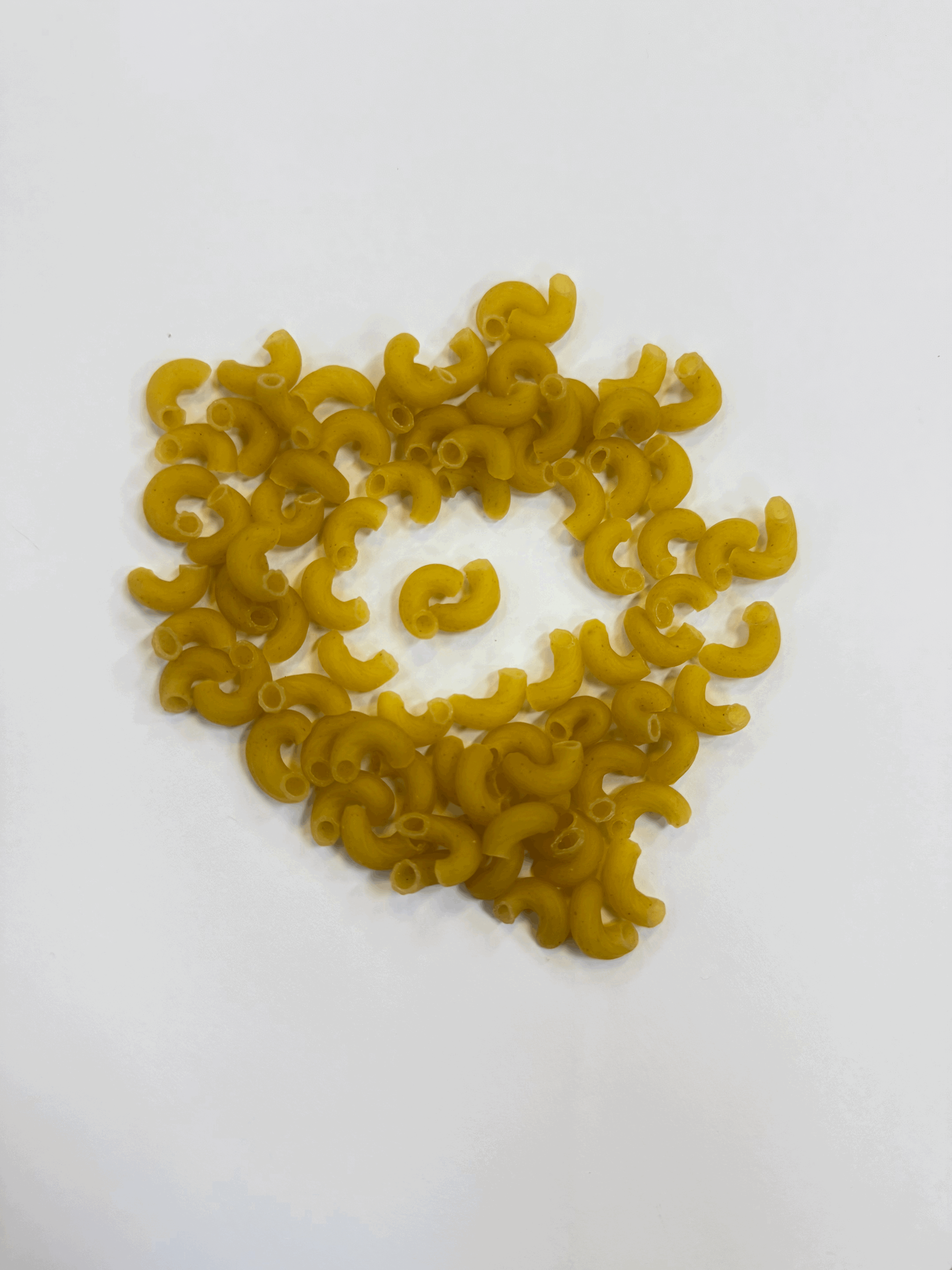
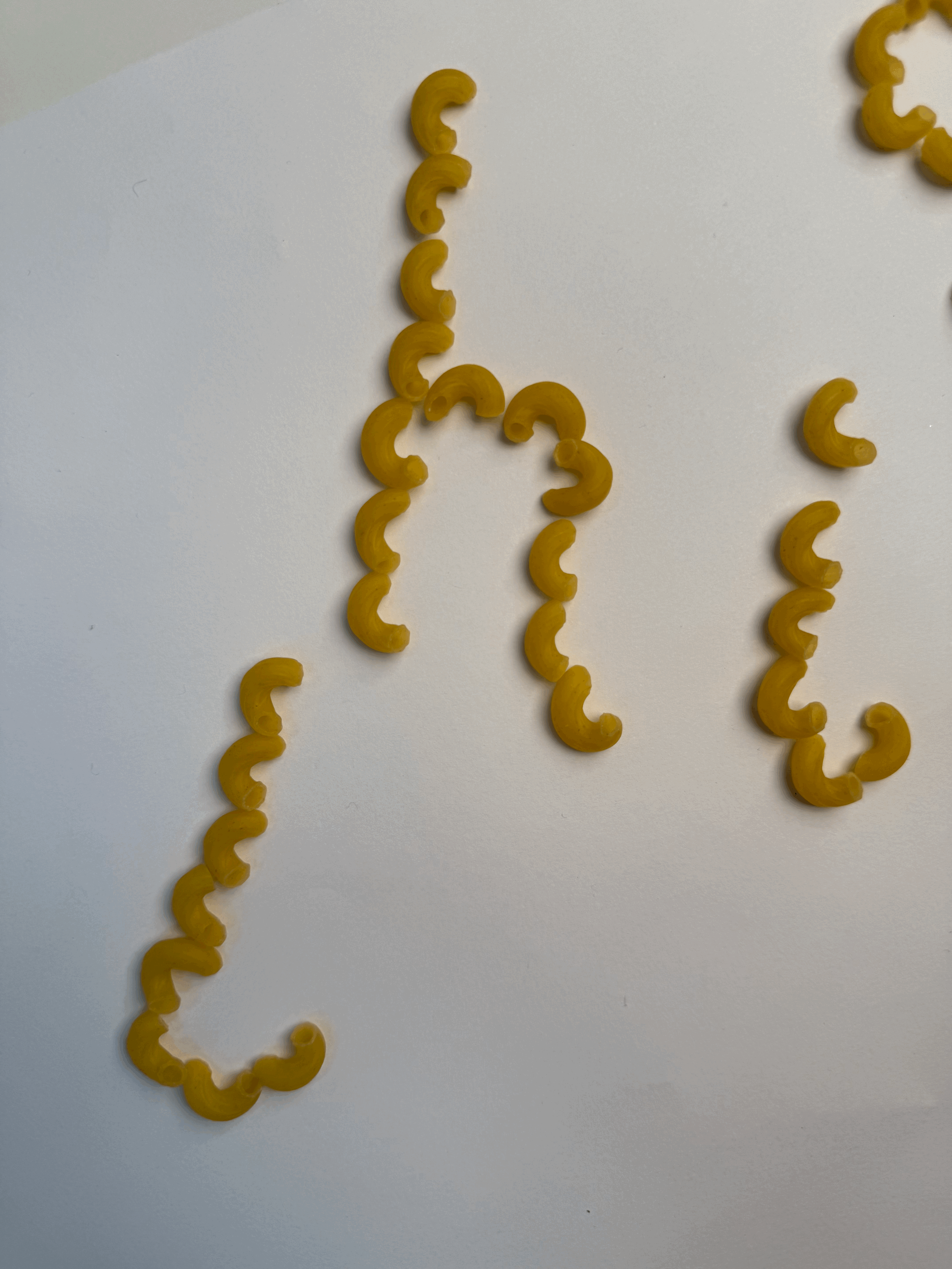
The macaroni alphabet was created with the question of, "How do I create letters without wasting anything?" in mind. I stumbled upon some macaroni pasta in the pantry and thought it'd be fun to use. In the first photo, I wanted to play around and see if using negative space to make the letter would be interesting. It was interesting, but also very chaotic and I felt like it was too hard to read. Then, I began to play with how to place the macaroni- whether or not to face them inwards or outwards.
process continued:


outcome:
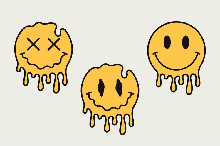
project 02: music

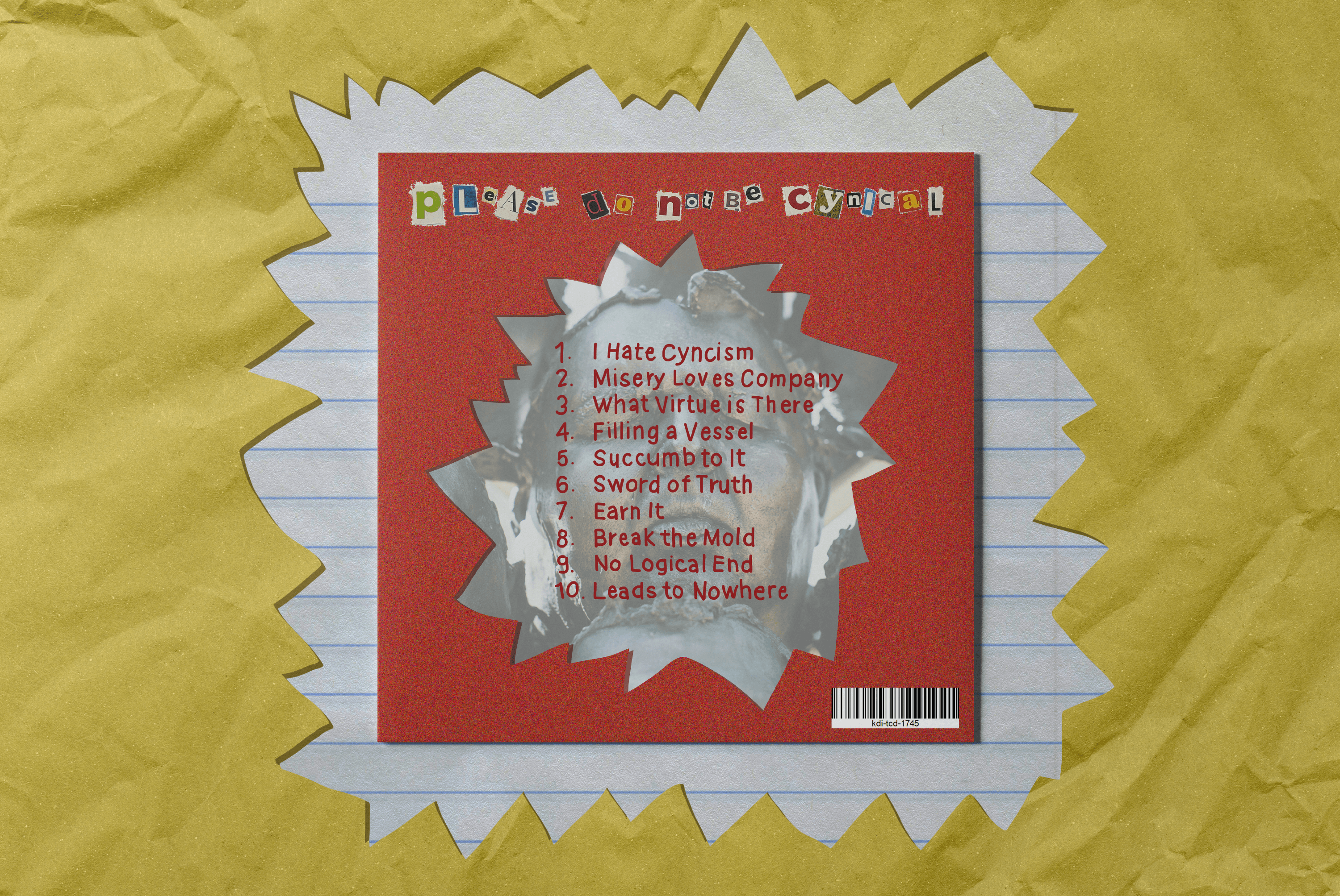
These are some photos I used for inspiration! When I was assigned KDIT-CD, I immediately gravitated towards a pop-punk or punk aesthetic. My first thought was to look at Paramore's early albums and go from there.
I noticed that pop-punk or punk albums are bold and full of texture. There's jagged edges, ripped paper, doodles, and fun use of bold colors. I love drawing doodles so I headed towards that direction when designing this album cover.
process:
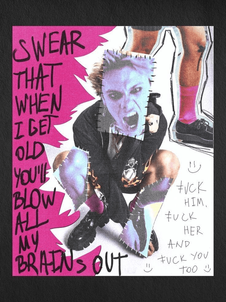


I really struggled with layout and was unsure of how to place all the words and make sure there was a hierarchy. I spent a lot of time moving things around and experimenting with filters in Photoshop.
Once I had everything placed in a way I liked, I started doodling. The sharp edges were inspired by the idea of ripped paper. The campfire doodle was something random because all the punk doodles were skulls and lightning. Although interesting, I wanted to do something different.
Linked is the playlist I created as inspiration.
process continued:


outcome:
project 03: packaging
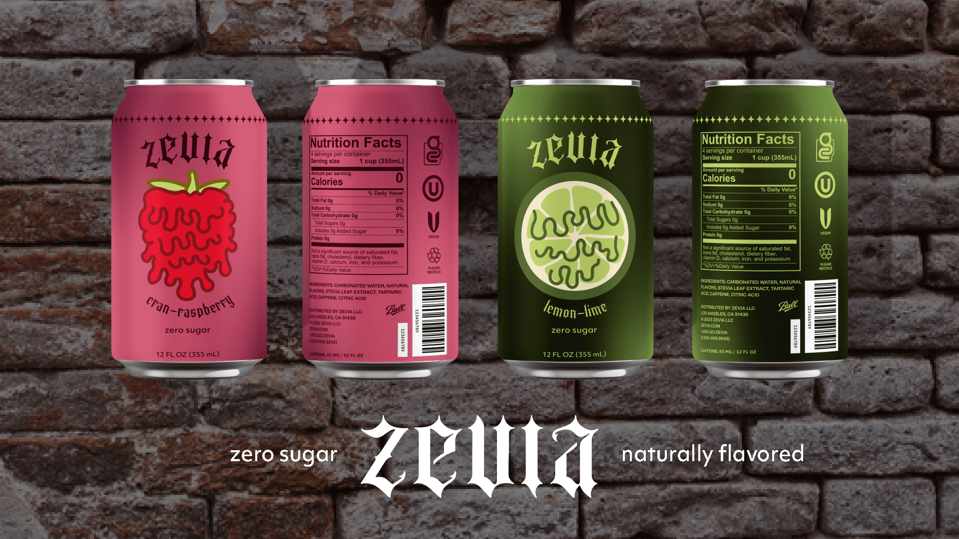
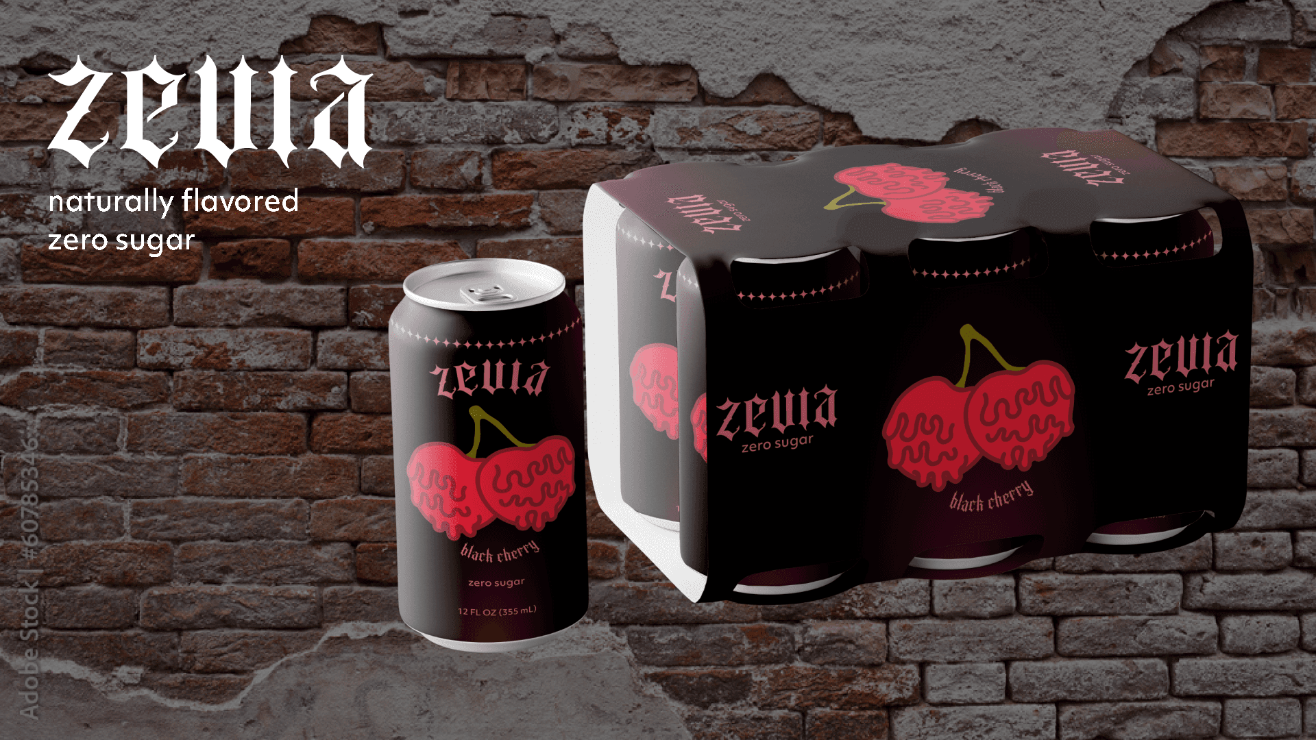
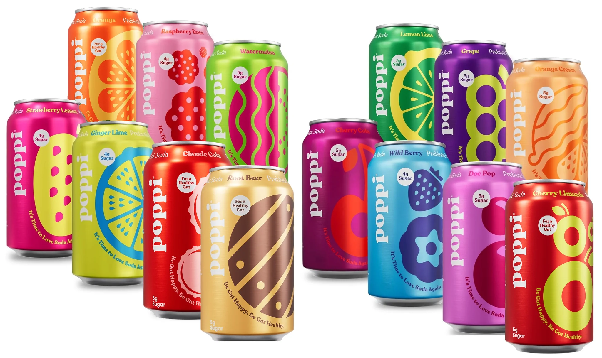
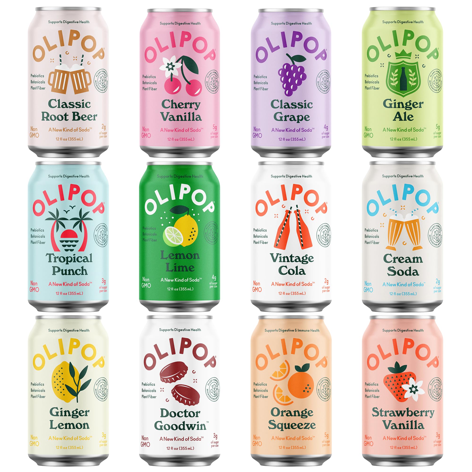
When beginning this project, I looked at current "healthy" beverages. I noticed that they're all similar to Poppy and Olipop. The design is colorful and illustrative.
After this research, I wanted to do something different. I started to look at fonts and ended up upon Sepian. Sepian started to give me ideas about my ideal target market: alternative teenagers and young adults.
Zevia in Sepian felt a little too chaotic to me so I began reducing edges and played with spacing.
process:
I began playing with layout, especially with where Zevia would go. Someone had off handedly suggested curving the Zevia and I thought it would look great so I incorporated that along with the flavor.
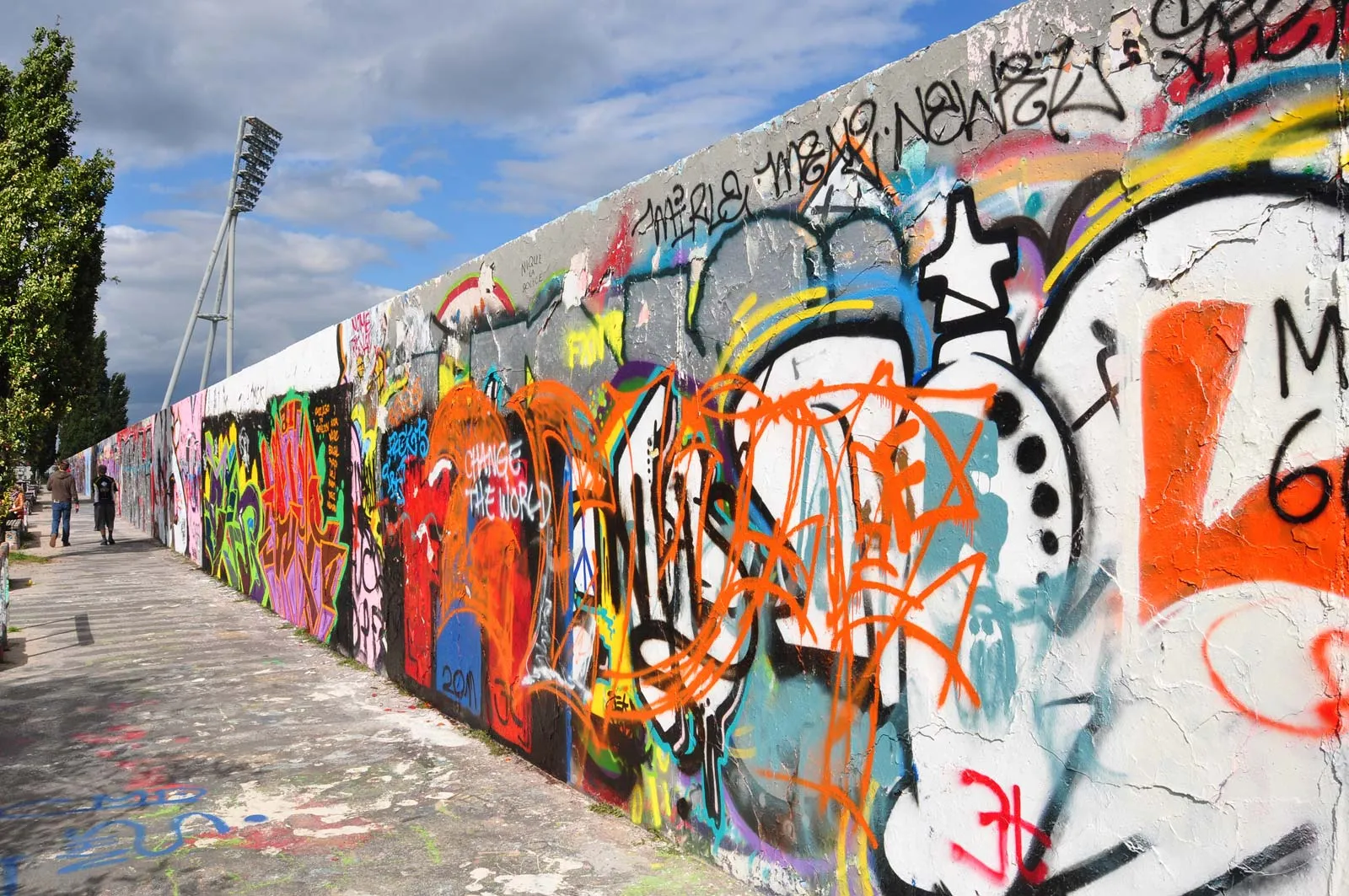
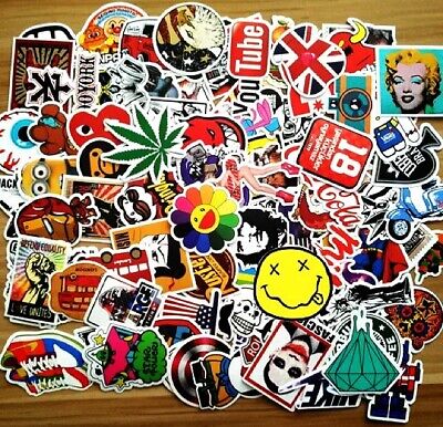
With my target market in my mind, I started thinking a lot about grafitti, stickers, and messy/grunge vibes. This really pushed me to play around with the background.
process continued:

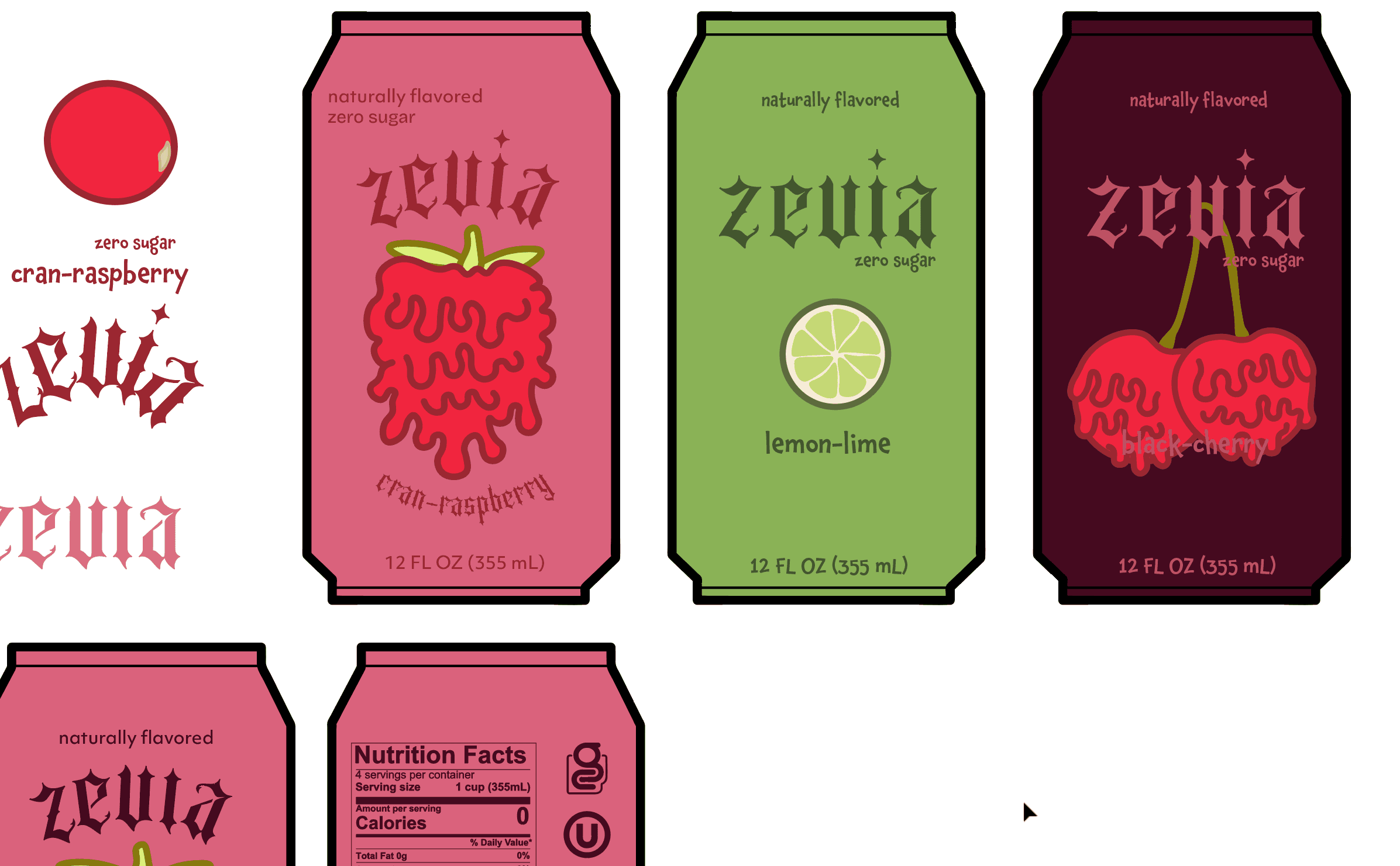
outcome: